Windows annoyances #481
Important information crammed into a dialogue box which is tiny by default and (even worse) can't be maximised nor resized. The user is forced to scroll so many times to work with this window, eventually assuming that Microsoft is messing them around even harder than usual.
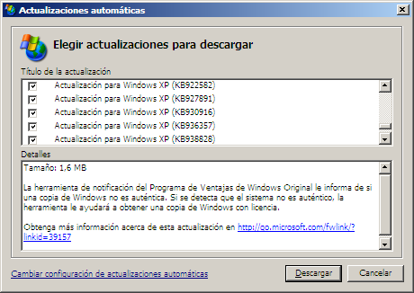
Especially bad in this particular case, as there are two panels and the
information displayed at the bottom depends on the selected item at the
top. So it's not enough to scroll the upper list to read the bottom
field — you actually have to keep on jumping between the two panels,
sometimes to reveal just the odd line or two that remain hidden beyond
the border of the text field. This criminal dialogue box (plus a few
others like this one) has been happily living inside many flavours of
Windows for years now. I reckon there must be a very good technical
reason to keep things this shitty suboptimal, but I don't know
it. Why? I mean, why?