Know where (not) to touch
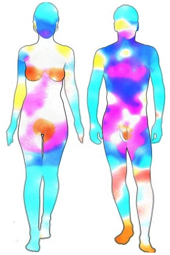
Via Kirai I stumbled on the results of this survey that collects information about erogenous zones. Apparently, thousands of men and women were asked to rank different spots in their bodies and the bodies of a partner — in terms of how much they they like to be touched, and how much they desire to touch the other, respectively. The study is interesting, but I found it somewhat annoying that it is difficult to draw what seems to me like an important conclusion: a comparison between where we think that the other likes to be touched and where he or she actually likes to be touched the most. The body maps provided show coloured zones, but it is difficult to compare women's guess to men's desires, for instance, because the variations in hue are quite subtle. Even if the images are displayed side-by-side, bare-eyed it is hard to notice any change at all in most regions of the body. I am always up for a bit of a Gimp-challenge. So I decided to try and edit the original images to obtain a better representation. This is my take on the results of the survey:
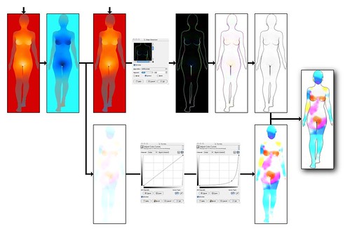
The hot colours (no pun intended) dye areas where we are not touched as much as we would like, so to speak. That is yellow, orange, pink, violet and red. In less academic terms, you could read cool colours, i.e. all shades of blue, as “will you put your hand off now”. I find it much easier here to identify those areas at a glance. Now there are some interesting results in here. Boys, did you notice those three orange/red spots in the female body? That's good news or what. Also, it seems that she doesn't like to be touched in her head and face that much, except that apparently you are not kissing her enough. Oh, and for some reason her right arm expects more attention than her left arm (?). About men, feet and knees look a bit frustrated, in contrast with the arms, which are asking for some independence and need more space, you know, to live their lives or whatever. Penises demand more attention (yes, even more). But not the scrotum. The scrotum is fine, thank you. The diagram below summarises the process that I followed using Gimp. The female images are used here, but the same applies to the other case. The single most important step, on the left side of the image, involves inverting the colours of the image that represents where women are touched, and then adding it to the picture that represents where women want to be touched. Effectively, we are substracting one from the other. The branch at the bottom simply emphasizes colours to make them more apparent. The steps on the top-center of the image produce black-on-white edges that are used as a frame so that regions of the body become more recognisable.

